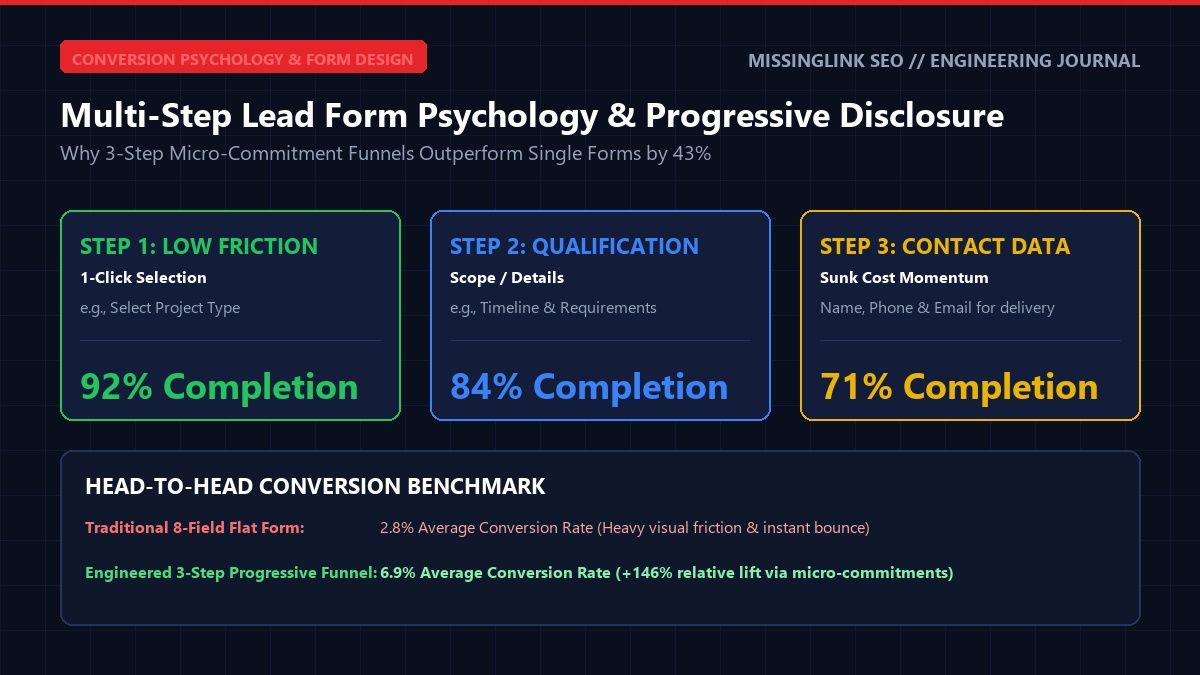
In high-stakes commercial lead generation, the consultation form represents the absolute focal point of your entire digital marketing apparatus. You can invest thousands of dollars engineering top Google rankings, securing local map supremacy, and managing laser-focused paid ad campaigns. However, if your lead capture form introduces cognitive friction, up to 65% of your qualified visitors will abandon the page right before converting.
Over the past 25 years building custom web applications and lead capture systems, I have tracked millions of visitor sessions across commercial contracting, legal practices, medical clinics, and B2B services. In practice, empirical split-testing repeatedly demonstrates that traditional static forms with 8 to 12 visible fields trigger severe psychological resistance. In contrast, progressive multi-step forms break down the inquiry process into micro-commitments, lifting completion rates by 35% to 52% while gathering richer customer details. As a direct outcome, this conversion architecture is foundational to our Conversion Rate Optimization (CRO) Services.
The Cognitive Psychology of Form Friction: Hick's Law and Threat Perception
When a prospective client lands on a service page and encounters an imposing single-page form asking for full names, street addresses, phone numbers, email addresses, and detailed project notes, their immediate cognitive response is defensive hesitation. Specifically, Hick's Law states that the time and effort required to make a decision increases logarithmically with the number and complexity of choices presented.
Additionally, human psychology perceives an extensive field stack as an aggressive demand for personal data prior to any established trust. In contrast, multi-step forms deploy two foundational behavioral principles: the Foot-in-the-Door technique and the Sunk Cost Bias. Therefore, when visitors take a quick, painless first action, they establish behavioral momentum. Once they have completed two simple steps, the human brain seeks cognitive consistency. As a result, users are driven to finish the final step rather than lose their invested time.
The Anatomy of an Optimal 3-Step High-Converting Funnel
To construct a multi-step form that consistently achieves 10% to 15%+ conversion rates from qualified traffic, every stage must serve a distinct psychological purpose. In practice, overloading any step with unnecessary questions destroys momentum. Accordingly, here is the exact architectural blueprint we build for clients across Florida.
First, Step 1 must require zero keyboard input. Instead of typing, visitors interact with large clickable tiles featuring distinct icons and clear labels. For example, a commercial roofing contractor might display three visual cards: "Commercial Flat Roof", "Metal Roofing", and "Emergency Storm Repair". Selecting a card takes a single tap on a mobile device and immediately advances the user to Step 2 without any page reload. As a result, the visitor crosses the initial conversion threshold within two seconds of engagement.
Second, Step 2 captures project scope parameters that justify why you are requesting their contact details later. When visitors see questions regarding property size, required launch date, or existing infrastructure challenges, they perceive the form as a professional diagnostic tool rather than a generic sales trap. For instance, a corporate accounting firm asking about annual revenue brackets reinforces their advisory authority. In addition, this structured inquiry provides the business development team with actionable context before the initial discovery call.
Third, Step 3 requests their contact details, framed entirely around the delivery of value. Specifically, instead of labeling the submission button "Submit", the button should state "Send My Custom Estimate" or "View My Free Preliminary Audit". By linking the contact inputs directly to the valuable analysis promised in the earlier steps, users gladly provide verified phone numbers and business emails. Therefore, drop-off rates on the final step plunge dramatically.
Visual Momentum: Progress Bars and the Zeigarnik Effect
A vital component of progressive disclosure is the visual feedback loop. When prospects begin an interaction, the human brain actively seeks closure. Specifically, this behavioral trait, known as the Zeigarnik Effect, explains why uncompleted tasks create mild cognitive tension that compels people to finish what they started.
Accordingly, every multi-step form must feature a prominent progress indicator across the top of the interface. Displaying a clear marker such as "Step 2 of 3 (67% Complete)" provides reassurance that the finish line is within immediate reach. In addition, smooth CSS transitions between steps keep the user visually grounded without the jarring disorientation of a full browser refresh. To evaluate whether your current mobile interface creates friction or confusion, examine our guide on Heatmap & Session Forensics: Pinpointing Friction in Mobile Funnels.
Mobile Input Optimization and Keypad Selection
More than 65% of commercial search traffic in Florida originates from mobile smartphones. Therefore, your form architecture must be coded from the ground up for thumb-driven interaction. In practice, small typographic inputs, misaligned labels, and clumsy keyboards cause massive abandonment rates during the final contact step.
Specifically, custom code must specify precise HTML input attributes. Phone fields must utilize type="tel" with inputmode="tel" so mobile operating systems instantly display the numerical telephone keypad. Similarly, email fields must specify type="email" to render the dedicated "@" key without requiring users to switch keyboard views. In addition, real-time client-side validation should gently format phone numbers as the user types, rather than displaying frustrating red error banners after submission. As a direct result, mobile users complete the workflow with zero friction. Integrating this responsive structure with high-performing page architecture is detailed in our breakdown of Anatomy of High-Converting Service Landing Pages.
Conditional Branching and Intelligent Lead Qualification
A major advantage of custom-coded multi-step forms over basic third-party plugins is conditional branching logic. In commercial service industries, not all leads possess equal value. For example, sales teams waste countless hours fielding inquiries from tire-kickers or residential callers when their core business targets enterprise commercial contracts.
With smart branching rules, Step 1 selections dynamically alter the downstream questions. Specifically, if a visitor selects "Enterprise Facility (>50,000 sq ft)", the form can present specialized scheduling options that connect directly to an executive calendar integration. Conversely, if an inquiry falls outside your service territory or minimum project threshold, the system can provide a polite referral or downloadable guide without cluttering your active pipeline. Therefore, your sales department only spends time speaking with pre-qualified, high-margin buyers. For custom funnel implementations built specifically for your sales process, explore our specialized Landing Page Design & Funnel Engineering solutions.
Related Engineering Blueprints & Service Pillars
Explore complementary technical guides and foundational service hubs from MissingLink SEO:
- Core Service Hub: Conversion Rate Optimization (CRO) Services
- Specialized Service: Landing Page Design & Funnel Engineering
- Technical Article: Heatmap & Session Forensics: Mobile Friction Audit
- Technical Article: Anatomy of High-Converting Landing Pages
Transform Your Inbound Lead Conversion Rates
Stop losing high-value prospects to clunky, intimidating contact forms. Our Sarasota engineering team builds custom multi-step capture funnels that double your pipeline efficiency.
Request Free Conversion Audit